After talking about it in depth, Laura and I decided to add small changes to our piece including a different way to present it.
The sound; as it has to be calming and distracting from the outside world, we decided to pan the frequencies so it creates a "ping pong" effect where the sounds go from left to right in your head without having to make them do that in the edit (if that makes sense). Your brain tells you that the frequencies are moving from left to right when they're actually parallel in panning and not moving at all.
By using a program called Max 6.1 I was able to create patches that meant I could test specific frequencies that I wanted to use in the audio.
After a lot of tests I exported frequencies of 30Hz, 104Hz and 106Hz I then mixed them together and panned them with 30Hz in the centre and the others to the left, I then copied the higher frequencies and panned them to the right, and made sure they were directly opposite in terms of stereo field. This then created the "ping pong" effect. I then decided that the 30Hz was too loud and created distortion that didn't sound nice, I then pulled it back to create more of background noise.
I added in speaking that I distorted into the foreground to create depth, I then panned them to walk around the person listening but not to obvious that it distracts them from what they will be watching on the screen.
_____________________
After another meeting with Rosie, Laura and I came up with a different way of presenting it.
Laura had visited a museum in Amsterdam where they had an entire room filled with bean bags that you could lie on and watch projections that are on the ceiling.
We decided to take that idea and potentially use it for our project and have two bean bags that are either side of a projector and make the audience watch it on the ceiling. This idea however we thought would be better for the gallery in January, so we are currently working on the box idea still.
PRESENTATION
As the box idea seems to be ever changing we decided to branch out from that and almost give it a theme. We decided as the theme was linked to death and the journey from life to death, that we could present it in a way where it looks like a memorial to someone.


We thought the idea of having flowers all around the box and letting them die would be a good way to symbolise it however we thought it may be to cheesy and takes away from the main part of our project. The accessories around the the box however was just ideas that we came up with and again took away from the main focus and it all became to cluttered.
After a lot of deliberation we decided that we should go back to our original idea and just have the box.
The next thing on our list was how to have the hole or view finder.
There was a lot of discussion of different methods and we agreed that the simpler the better and maybe even the smaller the better.
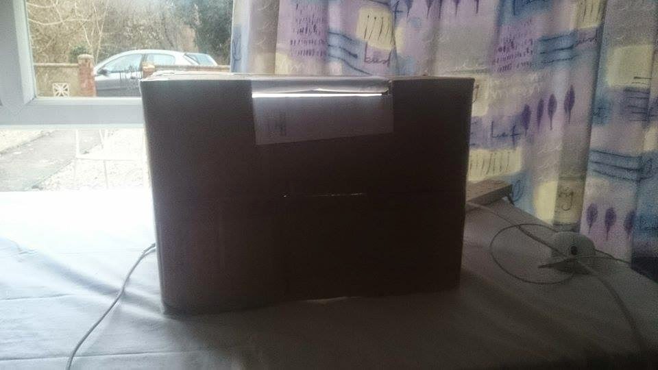
The final prototype, we decided to have the view finder at the top of the box, below are some pictures of our tests.


Our prototypes of "eye holes".
We decided the one at the top would be the best one as it makes you look down and is a lot more comfy to use. We have then made a piece of card to cover the keyboard of the laptop and also to direct the audiences focus.

THE BUSINESS CARDS
One way that Laura thought would be a good way to describe our idea was to put business cards with our names, the names of the piece and a link to a website where people can read about our idea, instead of putting lots of information around the box. This way in the gallery the box is the main focus and nothing takes away from it.

Laura and I came up with some ideas for the business cards and designed some different things, but agreed that the more simple the better.
This is my initial idea;


I wasn't sure whether it would be a good idea to make the font a traditional font in the sense of what you associate with a funeral, so I made two with different fonts.
The back design I wasn't sure whether to have black or white as it would look aesthetically pleasing to have white as it would contrast to the black much like the idea behind the journeys from life to death, however I wasn't sure whether that was to overly complicated.

I think the simplicity of the cards is essential because our whole idea and message behind it is so simple, if we start adding complicated and extravagant designs to it, it could loose what we originally wanted.
THE WEBSITE
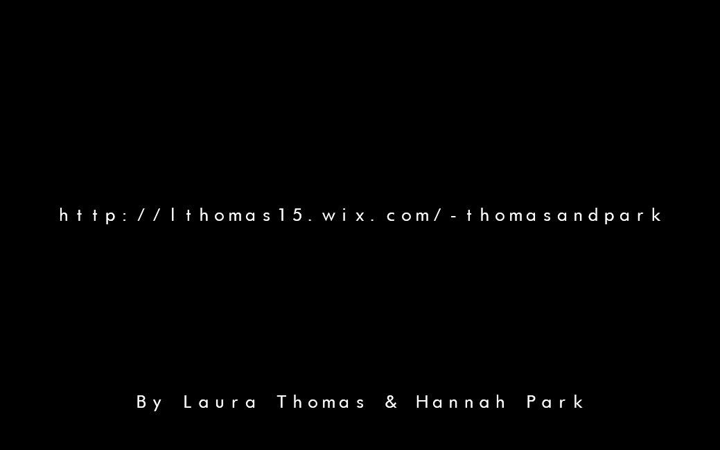
Laura being computer whizz made a website for the project. It's pretty self explanatory and it is simple and in keeping with the theme of our entire project.
http://lthomas15.wix.com/-thomasandpark
No comments:
Post a Comment