Showing posts with label DEVELOPMENT. Show all posts
Showing posts with label DEVELOPMENT. Show all posts
Tuesday, 9 December 2014
An attempt at linking my work
This is embedded from my sound cloud made for this project, if it doesn't work follow this link;
https://soundcloud.com/haa-nah-park

Putting the box into the Gallery, should we use beanbags?

I really like the idea of putting the box in the gallery. However as it is such a small box there is potential for it to get ignored when there are other things in the room.
We would like to put it on a table in either the corner of the room or the centre of the room. However there are things we need to consider such as a charger for the laptop and we wouldn't be able to put the laptop in the centre of the room as the cable would be a health and safety hazard. This will limit us to the walls.
The other idea with the bean bags could potentially work however, with a projector projecting images onto the ceiling could mean that the light would spill out over the room and loose quality and there would then be more complications.
With our box at the moment it is obviously just the prototype and when put in the gallery it will be made from wood. I feel that if there is no sign posts for it and it is very discrete it will be more mysterious to those who do find it potentially.
My drawing above on the floor plan is obviously not to scale (to be honest I'm not sure what measurements the drawing is) but we would want to place it either on a table or build a plinth for it to sit on. We thought that a table and chair could work, or maybe even without a chair as you can just peer in the top and put the headphones on.
Forgetting to publish posts - Development on the final idea
After our meeting with Rosie, Laura and I decided that we needed to add things to just a bass sound and swirly images, the idea of keeping it simple would still apply as sometimes things are better when they are less complicated.
After talking about it in depth, Laura and I decided to add small changes to our piece including a different way to present it.
The sound; as it has to be calming and distracting from the outside world, we decided to pan the frequencies so it creates a "ping pong" effect where the sounds go from left to right in your head without having to make them do that in the edit (if that makes sense). Your brain tells you that the frequencies are moving from left to right when they're actually parallel in panning and not moving at all.
By using a program called Max 6.1 I was able to create patches that meant I could test specific frequencies that I wanted to use in the audio.
After a lot of tests I exported frequencies of 30Hz, 104Hz and 106Hz I then mixed them together and panned them with 30Hz in the centre and the others to the left, I then copied the higher frequencies and panned them to the right, and made sure they were directly opposite in terms of stereo field. This then created the "ping pong" effect. I then decided that the 30Hz was too loud and created distortion that didn't sound nice, I then pulled it back to create more of background noise.
I added in speaking that I distorted into the foreground to create depth, I then panned them to walk around the person listening but not to obvious that it distracts them from what they will be watching on the screen.
_____________________
After another meeting with Rosie, Laura and I came up with a different way of presenting it.
Laura had visited a museum in Amsterdam where they had an entire room filled with bean bags that you could lie on and watch projections that are on the ceiling.
We decided to take that idea and potentially use it for our project and have two bean bags that are either side of a projector and make the audience watch it on the ceiling. This idea however we thought would be better for the gallery in January, so we are currently working on the box idea still.
PRESENTATION
As the box idea seems to be ever changing we decided to branch out from that and almost give it a theme. We decided as the theme was linked to death and the journey from life to death, that we could present it in a way where it looks like a memorial to someone.


We thought the idea of having flowers all around the box and letting them die would be a good way to symbolise it however we thought it may be to cheesy and takes away from the main part of our project. The accessories around the the box however was just ideas that we came up with and again took away from the main focus and it all became to cluttered.
After a lot of deliberation we decided that we should go back to our original idea and just have the box.
The next thing on our list was how to have the hole or view finder.
There was a lot of discussion of different methods and we agreed that the simpler the better and maybe even the smaller the better.
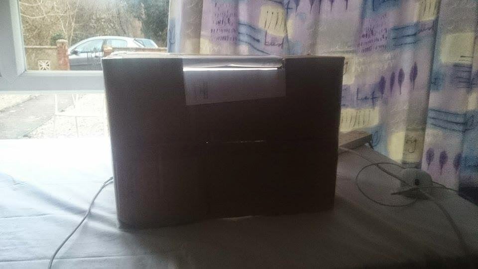
The final prototype, we decided to have the view finder at the top of the box, below are some pictures of our tests.


Our prototypes of "eye holes".
We decided the one at the top would be the best one as it makes you look down and is a lot more comfy to use. We have then made a piece of card to cover the keyboard of the laptop and also to direct the audiences focus.

THE BUSINESS CARDS
One way that Laura thought would be a good way to describe our idea was to put business cards with our names, the names of the piece and a link to a website where people can read about our idea, instead of putting lots of information around the box. This way in the gallery the box is the main focus and nothing takes away from it.

Laura and I came up with some ideas for the business cards and designed some different things, but agreed that the more simple the better.
This is my initial idea;


I think the simplicity of the cards is essential because our whole idea and message behind it is so simple, if we start adding complicated and extravagant designs to it, it could loose what we originally wanted.
THE WEBSITE
Laura being computer whizz made a website for the project. It's pretty self explanatory and it is simple and in keeping with the theme of our entire project.
http://lthomas15.wix.com/-thomasandpark
After talking about it in depth, Laura and I decided to add small changes to our piece including a different way to present it.
The sound; as it has to be calming and distracting from the outside world, we decided to pan the frequencies so it creates a "ping pong" effect where the sounds go from left to right in your head without having to make them do that in the edit (if that makes sense). Your brain tells you that the frequencies are moving from left to right when they're actually parallel in panning and not moving at all.
By using a program called Max 6.1 I was able to create patches that meant I could test specific frequencies that I wanted to use in the audio.
After a lot of tests I exported frequencies of 30Hz, 104Hz and 106Hz I then mixed them together and panned them with 30Hz in the centre and the others to the left, I then copied the higher frequencies and panned them to the right, and made sure they were directly opposite in terms of stereo field. This then created the "ping pong" effect. I then decided that the 30Hz was too loud and created distortion that didn't sound nice, I then pulled it back to create more of background noise.
I added in speaking that I distorted into the foreground to create depth, I then panned them to walk around the person listening but not to obvious that it distracts them from what they will be watching on the screen.
_____________________
After another meeting with Rosie, Laura and I came up with a different way of presenting it.
Laura had visited a museum in Amsterdam where they had an entire room filled with bean bags that you could lie on and watch projections that are on the ceiling.
We decided to take that idea and potentially use it for our project and have two bean bags that are either side of a projector and make the audience watch it on the ceiling. This idea however we thought would be better for the gallery in January, so we are currently working on the box idea still.
PRESENTATION
As the box idea seems to be ever changing we decided to branch out from that and almost give it a theme. We decided as the theme was linked to death and the journey from life to death, that we could present it in a way where it looks like a memorial to someone.
We thought the idea of having flowers all around the box and letting them die would be a good way to symbolise it however we thought it may be to cheesy and takes away from the main part of our project. The accessories around the the box however was just ideas that we came up with and again took away from the main focus and it all became to cluttered.
After a lot of deliberation we decided that we should go back to our original idea and just have the box.
The next thing on our list was how to have the hole or view finder.
There was a lot of discussion of different methods and we agreed that the simpler the better and maybe even the smaller the better.
The final prototype, we decided to have the view finder at the top of the box, below are some pictures of our tests.
Our prototypes of "eye holes".
We decided the one at the top would be the best one as it makes you look down and is a lot more comfy to use. We have then made a piece of card to cover the keyboard of the laptop and also to direct the audiences focus.
THE BUSINESS CARDS
One way that Laura thought would be a good way to describe our idea was to put business cards with our names, the names of the piece and a link to a website where people can read about our idea, instead of putting lots of information around the box. This way in the gallery the box is the main focus and nothing takes away from it.
Laura and I came up with some ideas for the business cards and designed some different things, but agreed that the more simple the better.
This is my initial idea;
I wasn't sure whether it would be a good idea to make the font a traditional font in the sense of what you associate with a funeral, so I made two with different fonts.
The back design I wasn't sure whether to have black or white as it would look aesthetically pleasing to have white as it would contrast to the black much like the idea behind the journeys from life to death, however I wasn't sure whether that was to overly complicated.
I think the simplicity of the cards is essential because our whole idea and message behind it is so simple, if we start adding complicated and extravagant designs to it, it could loose what we originally wanted.
THE WEBSITE
Laura being computer whizz made a website for the project. It's pretty self explanatory and it is simple and in keeping with the theme of our entire project.
http://lthomas15.wix.com/-thomasandpark
Friday, 7 November 2014
Final Idea - A break down
We wanted to create an immersive piece of installation work based on the spiritual journey of the afterlife. By using sound and light as visuals we wanted to make the viewer on an emotional journey to take what we have researched after life to be like.
Originally our final idea was to create a mask for the viewer to wear so that the viewer is fully immersed in the experience.
However we thought that could prove to be quite complicated, so decided to present it in a box that the audience would look in to.
With a mixture of lights fading in and out within the box, put together with sound that is made from a specific range of frequencies this should hopefully be quite a calming experience. The limit of time aloud would be 2 and a half minutes maximum due to potential health and safety otherwise the viewer could potentially hurt their ears and eyes.
THE IDEA - BREAKDOWN
Duration: the visuals and audio will be on a loop but it will be 2 - 2 and a half minutes long. The reason for it looping would be so people can watch from any point.
Visuals: They will be created in after effects it would simply be black fading to an off white (maybe a beige because bright white could hurt the viewers eyes at such close range) Thus creating a calming experience. Throughout the parts that are light there will be silhouettes of people/faces getting closer to the audience as the duration goes on, almost like they are walking through a tunnel , which from our research is a common occurrence in near death experiences.
We would like the visuals to be all over the box to give the viewer an all round feeling, like it's surrounding them.
Sound: ideally we would like to use binaural sound so that it moves in and out with the visuals. Another idea was to move the sounds round the viewers head making them feeling disorientated.
The collections of frequencies would not only be audible but you can also feel the lower frequencies in your chest.
There will be a sub bass of around 30Hz and on top of that we will layer other higher frequencies that harmonise with each other to create a tone that is calming.
Another part would be a deep voice telling the viewer to wake up as some people have experienced that too. However it wouldn't be the main part of the audio.
Presentation: we would quite like to build a box from wood that could either fit a computer screen in it or create a periscope type box that has mirrors to reflect lights that we put in it, meaning that we can create most of the visual physically rather than all on computer.
We will be testing both ideas to see which one works best.
Originally our final idea was to create a mask for the viewer to wear so that the viewer is fully immersed in the experience.
However we thought that could prove to be quite complicated, so decided to present it in a box that the audience would look in to.
With a mixture of lights fading in and out within the box, put together with sound that is made from a specific range of frequencies this should hopefully be quite a calming experience. The limit of time aloud would be 2 and a half minutes maximum due to potential health and safety otherwise the viewer could potentially hurt their ears and eyes.
THE IDEA - BREAKDOWN
Duration: the visuals and audio will be on a loop but it will be 2 - 2 and a half minutes long. The reason for it looping would be so people can watch from any point.
Visuals: They will be created in after effects it would simply be black fading to an off white (maybe a beige because bright white could hurt the viewers eyes at such close range) Thus creating a calming experience. Throughout the parts that are light there will be silhouettes of people/faces getting closer to the audience as the duration goes on, almost like they are walking through a tunnel , which from our research is a common occurrence in near death experiences.
We would like the visuals to be all over the box to give the viewer an all round feeling, like it's surrounding them.
Sound: ideally we would like to use binaural sound so that it moves in and out with the visuals. Another idea was to move the sounds round the viewers head making them feeling disorientated.
The collections of frequencies would not only be audible but you can also feel the lower frequencies in your chest.
There will be a sub bass of around 30Hz and on top of that we will layer other higher frequencies that harmonise with each other to create a tone that is calming.
Another part would be a deep voice telling the viewer to wake up as some people have experienced that too. However it wouldn't be the main part of the audio.
Presentation: we would quite like to build a box from wood that could either fit a computer screen in it or create a periscope type box that has mirrors to reflect lights that we put in it, meaning that we can create most of the visual physically rather than all on computer.
We will be testing both ideas to see which one works best.
Mood Board and other thoughts...
Thinking of how to portray a Near Death Experience.
Within our initial ideas of how to present the idea we thought about trying to create a trapped feeling Laura suggested making a coffin for the audience to lie in however due to health and safety we thought it best not to do that.
We then moved on to the idea of creating a smaller space or a room to immerse the viewer. However the idea of making a room didn't seem very feasible either.
We decided that using technology to create a rom could be better and by using technology to create a room could be better and by using a box to focus the viewer on the screen showing the visuals.
A method commonly used within gaming is the Oculus Rift. Its basically goggles with an interactive screen that you can play games on : - .http://youtu.be/ECyVSwzsSlE?t=2m10s
However they're extremely expensive so we were looking at how to create something similar.
http://www.oculus.com/

We thought of having flashback sequences and creating a fantasy world however we then decided that the idea could be more effective it was kept simple.
Some examples of Wes Andersons films include;


Within our initial ideas of how to present the idea we thought about trying to create a trapped feeling Laura suggested making a coffin for the audience to lie in however due to health and safety we thought it best not to do that.
We then moved on to the idea of creating a smaller space or a room to immerse the viewer. However the idea of making a room didn't seem very feasible either.
We decided that using technology to create a rom could be better and by using technology to create a room could be better and by using a box to focus the viewer on the screen showing the visuals.
A method commonly used within gaming is the Oculus Rift. Its basically goggles with an interactive screen that you can play games on : - .http://youtu.be/ECyVSwzsSlE?t=2m10s
However they're extremely expensive so we were looking at how to create something similar.
http://www.oculus.com/

We obviously don't have the budget for this.
The other ideas such as the Wes Anderson style film we wanted to incorporate the cinematographic style. The way in which Andersons film are shot is, we think quite calming, the way in which the colours and framing work together to make all the shots really satisfying.
When we were still unsure of whether to have a narrative we thought that if we were to have one we would film it in that style so that the colours and framing would make it peaceful and calming. We thought of having flashback sequences and creating a fantasy world however we then decided that the idea could be more effective it was kept simple.
Some examples of Wes Andersons films include;

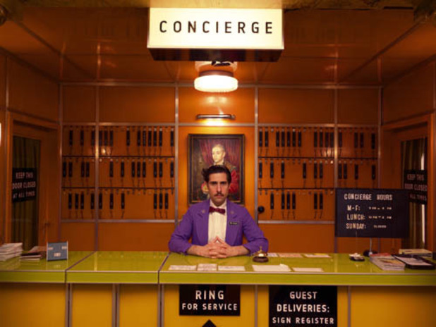
Please refer to my other blog post 'Why am I not Wes' for extra examples and unbelievable enthusiasm from me about his work.
A similar expereince to what we want to create is the sensory deprivation tank here is someone reactions to being in the sensory deprivation tank https://www.youtube.com/watch?v=2mMVipm_IQ0&list=UU4PooiX37Pld1T8J5SYT-SQ
After looking at examples of other peoples work, it made it easier for us to decide what we wanted to do.
The Research Process
Through talking to Laura about my initial idea for maps and journeys and recreating anxiety for the audience we decided that there should perhaps be a simpler theme in terms of journeys, as the anxiety path could be complicated to portray to the audience.
We wanted to create an experience that everyone could relate to/ be a part of, after brainstorming and coming up with ideas, not just for the theme but for the presentation as well, we narrowed it down to a few ideas and then branched out from those:
- Create a feeling of being lost in a woods, very dark atmospheric cinematography, maybe add fog / a smoke machine into the room.
- Replicate the feeling of anxiety, make the room feel like its getting smaller and create a paranoia through sound.
- create an elevator shaft and make it feel like it has broken down creating fear and make the viewer go on an emotional journey.
- make the viewer feel like they are trapped in a video game creating some kind of journey for them to go on.
- have a Wes anderson style to the video, very pretty high production design
- have a kind of surreal aspect like the Might Boosh
- create a spiritual journey representing what the after life is like, very deep bass sounds to feel through body, create a coffin so they are fully immersed in the experience
We agreed that the majority of our ideas were quite far fetched and would take a lot more than a student budget and the amount of time we have. The thought behind them however is what we wanted to focus on and the fact that it would get the audience to think... we hope.
We decided that we wanted to look into the Near death Experiences as it could be considered the most relatable as everyone will go through that experience, how morbid.
Laura researched into after life and the experiences related with that, I just looked into near death experiences and what comes with them.After looking at articles from people who have had near death experiences there are a certain set of "traits" linked to almost passing away.
http://www.nderf.org/ was a website I had found, completely dedicated to people sharing their near death experiences. I spent the majority of my time reading through peoples stories and picking out the similarities.
Laura also sent me some articles to look through in terms of near death experiences:
- http://www.dailymail.co.uk/news/article-2547714/Our-astonishing-near-death-stories-thousands-touched-thought-provoking-series-intensive-care-nurse.html
- http://listverse.com/2013/09/15/10-astonishing-near-death-experiences/
- http://science.howstuffworks.com/science-vs-myth/extrasensory-perceptions/near-death-experience1.htm
- http://www.dailymail.co.uk/news/article-2545668/Is-proof-near-death-experiences-ARE-real-Extraordinary-new-book-intensive-care-nurse-reveals-dramatic-evidence-says-banish-fear-dying.html
- http://www.dailymail.co.uk/health/article-24509/Near-death-patients-afterlife.html
The common things reoccurring in the experiences are;

When typing into an image search "Near Death Experience" these type of images come up, with bright lights and the portrayal of outer body experiences too.
The next stage would then be to recreate this in a way that we could put it into a gallery.
Monday, 27 October 2014
Initial Ideas for Maps and Journeys
When looking at the brief for maps and journeys I didn't really know what I wanted to do, but with the psychogeography work it gave me the idea to link the theme of being lost or stopped from going on your journey.
After realising that I don't really know what I'm going to do with my life I began to think about how I feel when I worry about my life, which is often.
When the holidays were in full swing I had a job and everything was great. I genuinely considered taking a gap year from uni and working full time to earn a bit more money.
The thought of going back to uni terrified me and the idea of the debt and similar loneliness I felt last year was not something I wanted to experience again. Granted I did enjoy uni last year, but this year I'm not in halls and without that security my anxiety and constant feeling of being paranoid has doubled. So I thought as a way of coping with the stress I could channel it into my work.
My first idea was to use sound as the main focus, creating a space for the audience to experience how I feel on a daily basis. The idea was to recreate the panic and anxiety I often get when thinking about what I have to do to be considered successful. My initial thoughts were to have headphones that the audience would wear and by using different frequencies create different feelings. The lower the frequency the less you can hear and the more you can feel so my idea was to layer things on top of a low frequency so you feel the sounds you are hearing.
After an hour and a big headache I figured out that the best frequency for the effect I wanted to create was around 30Hz. Just above what the human ear can hear, so there is a slight tone to the sound but you mostly feel it on your chest. I probably could have lower but with the headphones I was wearing 30Hz was the only one having the effect.
After listening to it for too long I started to get dizzy and I realised that that would be a health and safety risk so it would have to be limited to maybe 5 minutes.
As I would have to incorporate visual into this idea I felt on its own it wasn't really strong enough to stand alone as a piece. So after to talking to Laura we decided to join forces to create a stronger idea that would work better.
After realising that I don't really know what I'm going to do with my life I began to think about how I feel when I worry about my life, which is often.
When the holidays were in full swing I had a job and everything was great. I genuinely considered taking a gap year from uni and working full time to earn a bit more money.
The thought of going back to uni terrified me and the idea of the debt and similar loneliness I felt last year was not something I wanted to experience again. Granted I did enjoy uni last year, but this year I'm not in halls and without that security my anxiety and constant feeling of being paranoid has doubled. So I thought as a way of coping with the stress I could channel it into my work.
My first idea was to use sound as the main focus, creating a space for the audience to experience how I feel on a daily basis. The idea was to recreate the panic and anxiety I often get when thinking about what I have to do to be considered successful. My initial thoughts were to have headphones that the audience would wear and by using different frequencies create different feelings. The lower the frequency the less you can hear and the more you can feel so my idea was to layer things on top of a low frequency so you feel the sounds you are hearing.
After an hour and a big headache I figured out that the best frequency for the effect I wanted to create was around 30Hz. Just above what the human ear can hear, so there is a slight tone to the sound but you mostly feel it on your chest. I probably could have lower but with the headphones I was wearing 30Hz was the only one having the effect.
After listening to it for too long I started to get dizzy and I realised that that would be a health and safety risk so it would have to be limited to maybe 5 minutes.
As I would have to incorporate visual into this idea I felt on its own it wasn't really strong enough to stand alone as a piece. So after to talking to Laura we decided to join forces to create a stronger idea that would work better.
Wednesday, 8 October 2014
I forgot to type this up before!!
I was meant to type this up a week ago, but me being me I forgot.
The idea of psycho geography used to confuse me, to be honest I didn't really get it. After having to make multiple journeys without my ipod I realised what it means, I think. The task of making a trip is optional, you chose to go somewhere. However only some of those trips are journeys. I think that journeys are a trip where you learn something. Whether it's about yourself or something else. The art of wandering is also linked to psycho geography. where you don't have a specific route but you still are on a journey. Technically life is psycho geography as you are constantly on a journey. I like the idea of drawing lines or words on a map and following the lines. To link both those ideas of following a route and life they could work together but at the same time also contradict Some people follow a path in life and have a clear vision of where they're going. However many people live for the moment and don't follow a path or have a direction they want to go in. This could highlight the idea of life being art. In terms of my own bath and life psycho geography I don't know where I'm going, hence in this project I am following the theme of being lost. Or trying to. I like the idea of getting lost and trying to find my way back/ This links to my life in terms of the fact that I don't know where I'm going but I trying to figure it out. I am currently in the process of making a path to get me back on track.
The idea of psycho geography used to confuse me, to be honest I didn't really get it. After having to make multiple journeys without my ipod I realised what it means, I think. The task of making a trip is optional, you chose to go somewhere. However only some of those trips are journeys. I think that journeys are a trip where you learn something. Whether it's about yourself or something else. The art of wandering is also linked to psycho geography. where you don't have a specific route but you still are on a journey. Technically life is psycho geography as you are constantly on a journey. I like the idea of drawing lines or words on a map and following the lines. To link both those ideas of following a route and life they could work together but at the same time also contradict Some people follow a path in life and have a clear vision of where they're going. However many people live for the moment and don't follow a path or have a direction they want to go in. This could highlight the idea of life being art. In terms of my own bath and life psycho geography I don't know where I'm going, hence in this project I am following the theme of being lost. Or trying to. I like the idea of getting lost and trying to find my way back/ This links to my life in terms of the fact that I don't know where I'm going but I trying to figure it out. I am currently in the process of making a path to get me back on track.
The adventure that turned into a photoshoot.
I wanted to draw the word 'lost' on a map and follow it round Guildford in hope to get lost... however it turns out I actually know Guildford pretty well regardless of what I had originally thought. After going out and realising that I wasn't going to be able to do what I originally wanted to do.
Lots of words.
I went with my housemate Kate as we didn't have anything to do, we wandered through the high street, thinking about where to go and move my idea too.
We stumbled upon the castle. I must admit I had no idea there was a castle. My ignorance towards geography has been shown.
This castle was incredible it had loads of hidden passages. I actually managed to move my idea of being lost into the castle grounds. genius.
 Even though the castle grounds weren't particularly big the scenery and places within them were awesome.
You can see on the map how I marked out the word lost and to be perfectly honest at points I did feel lost because I had no clue where I was. If you asked me to take you to the castle now I wouldn't have any idea where to go!


Lots of words.
I went with my housemate Kate as we didn't have anything to do, we wandered through the high street, thinking about where to go and move my idea too.
We stumbled upon the castle. I must admit I had no idea there was a castle. My ignorance towards geography has been shown.
This castle was incredible it had loads of hidden passages. I actually managed to move my idea of being lost into the castle grounds. genius.
You can see on the map how I marked out the word lost and to be perfectly honest at points I did feel lost because I had no clue where I was. If you asked me to take you to the castle now I wouldn't have any idea where to go!
Im not usually one for photography I don't really consider myself to be a great photographer but I'm really pleased with how these photo's came out!
I used my Wes Anderson research to frame all of my shots and I really like how they've come out. It turns out that the castle grounds were quite symmetrical and easy to frame things in the middle.
The art of psycho-geography still confuses me but I do get the art of making a journey.
I left the castle grounds thinking about how I'd really like to return and soak up the area a bit more.
It was really peaceful and I just enjoyed being there. I can see that even though I am feeling lost at the moment this could be like my new beach (when I'm at home I drive to the beach to think... how very tumblr)
Even though I don't really remember where it is, I think it might be one of my favourite places in Guildford.
Tuesday, 7 October 2014
Preparing for Psycho-geography - Why am I not Wes Anderson

In preparation for going out and shooting my Psycho-Geography trip!
I've decided after my rant about Wes Anderson to take photos of my trip in his filming style.
I set up my camera with a specific picture profile and made markers out of a train ticket. I have also drawn a line down the centre of my camera screen so I can see where I need to put the anchor of my shot.
I then tested out using some things in my room (ignore the bed frame and highland cow)


I edited them using similar colours that Wes Anderson uses in his films and also practiced with the framing I had set up on my camera screen. It isn't ideal to use the screen instead of the view finder but to be able to get it how I want I will have to deal with it!!!
Wonderful Wes - A Wes Anderson Appreciation Post
I've never shown Wes Anderson's work any attention before, and this summer I wandered into my brothers room whilst he was watching The Grand Budapest Hotel and was instantly hooked.
In all honesty I can't tell you what happened because all I was watching was the cinematography, grading and general aesthetic of the film.
I must admit I can't really call myself a "fan" yet as I have only technically watched half of one of his films. Thats like wearing a Guns N' Roses t-shirt and saying you like their music when the truth is you can only name Sweet Child O' Mine as a song and only really know a bit to Welcome to the Jungle. It's just not a thing.
I went about my research in a weird way and instead of watching his films like I probably should have I read a book instead. This book was filled with interviews and stills from his films, along with pictures of behind the scenes (it was Wes Anderson by Matt Zoller Seitz - 2013)
Classic Hannah only really looks at the pictures - but that tells me a lot about what I currently take from his work/films - The style and over all look of the shots is what I love.
Obviously I plan to have an Anderson film binge and watch all 11 films of his but at the moment I'm sticking to just looking at the aesthetics for inspiration.
http://vimeo.com/89302848 < this video on vimeo montages some of Andersons work, putting a line through the centre of each shot, showing how he uses people or props to anchor the shot.
These examples are from Grand Budapest and The Life Aquatic, the shot from Life Aquatic shows how he seems to completely ignore the rule of thirds in the traditional way.
It is also noticeable that he keeps his shots at eye level which I really like.


The Auteur Theory applies with Anderson's work because of the colours that he uses and the general style of his films.
http://prezi.com/vxi534bdahww/auteur-theory-presentation-wes-anderson/
There is always a certain warmth to the colour and grading of the film. You can look at the specific colours that he uses and there is always a yellow and orange, green is hardly ever used and if it is it is made warmer.
I don't really understand the point of this post, except I want to use Wes Anderson cinematography/style in my projects and play around with how he shoots and see if I can recreate the look.
In all honesty I can't tell you what happened because all I was watching was the cinematography, grading and general aesthetic of the film.
I must admit I can't really call myself a "fan" yet as I have only technically watched half of one of his films. Thats like wearing a Guns N' Roses t-shirt and saying you like their music when the truth is you can only name Sweet Child O' Mine as a song and only really know a bit to Welcome to the Jungle. It's just not a thing.
I went about my research in a weird way and instead of watching his films like I probably should have I read a book instead. This book was filled with interviews and stills from his films, along with pictures of behind the scenes (it was Wes Anderson by Matt Zoller Seitz - 2013)
Classic Hannah only really looks at the pictures - but that tells me a lot about what I currently take from his work/films - The style and over all look of the shots is what I love.
Obviously I plan to have an Anderson film binge and watch all 11 films of his but at the moment I'm sticking to just looking at the aesthetics for inspiration.
http://vimeo.com/89302848 < this video on vimeo montages some of Andersons work, putting a line through the centre of each shot, showing how he uses people or props to anchor the shot.
These examples are from Grand Budapest and The Life Aquatic, the shot from Life Aquatic shows how he seems to completely ignore the rule of thirds in the traditional way.
It is also noticeable that he keeps his shots at eye level which I really like.
The Auteur Theory applies with Anderson's work because of the colours that he uses and the general style of his films.
http://prezi.com/vxi534bdahww/auteur-theory-presentation-wes-anderson/
There is always a certain warmth to the colour and grading of the film. You can look at the specific colours that he uses and there is always a yellow and orange, green is hardly ever used and if it is it is made warmer.
I don't really understand the point of this post, except I want to use Wes Anderson cinematography/style in my projects and play around with how he shoots and see if I can recreate the look.
Sunday, 27 April 2014
Cake Mix - A Summary, an Evaluation, a muddle of words that probably don't make sense.
Hannah Park | Laura Thomas | Leanna Saul | Amy Gwynne
"We showed 3 people a scene from a popular film and asked them to remember as many details as possible. We then re-enacted the scene based on their memories and recollection."
As this was originally my idea we decided that we would research into a popular moving image that has complicated parts that would require more that one watch to remember everything.
After looking at music videos as well as film, we decided that as music videos have such high production value it would be extremely difficult to replicated with little time and little money.
After a lot of research and thinking we decided to do the cake making scene from Bridesmaids (2011). There were complicated parts that would be difficult to remember but also parts that stood out. It also appealed to us as a scene because of the lack of dialogue. This meant there was potential to be experimental with the sound.
As my original idea required at least three videos to be filmed there was then discussion of who would do what when it came to production. Within our group we agreed we had a varied amount of strong points between us, but to be able to get out of our comfort zone we decided that we should each be responsible for a video each. Laura however wanted to and was good at preproduction so she stayed in the role of producer throughout.
The whole idea of the re-enactment was to show how people remember things differently. Through this we came up with the idea to play all 4 videos at the same time and use the voice overs to guide the audience. However this looked messy when filmed and edited together so through tutorials and group meetings we finalised the idea of the chinese whispers style editing where they would slowly get more and more different to the original showing how memories change over time and also change depending on who's memories they are.
BEING THE DIRECTOR, CINEMATOGRAPHER & CAMERA OPERATOR
The filming process didn't require to much technical skill as it was copying someone else's film. However with my film I had the person with the least recollection, so I decided to be creative with the filming. It was a risky move filming over exposed and it probably looked like a mistake but it was intentional and it was to achieve a dream like and un easy feeling when watching it.
I also tried to film exactly as the script read, so anything that wasn't mentioned wasn't filmed. This was difficult to do but I think it worked out okay.
POST PRODUCTION
In post production we decided to have specific jobs to get it all finished quicker. Laura edited each video to the original to try and make them comparable. Then Leanna graded and corrected the colour, Amy then put the final thing together with all the screens. Whilst this was happening I recorded Leanna, Amy and I reading voice overs of our shot lists that we had put together before hand. I then used these voice overs to mix with the song originally used in the scene. It turned out more effective to make the sound simple, rather than making it too experimental it was used to guide the audiences eye as intended but it a much simpler way as the video would have been even more difficult to follow.
TO CONCLUDE...
The over all experience was an experience... it turned out to be a much more difficult video than planned, and especially with the editing and composing we realised we didn't think about that when filming. Although we had detailed planning and a lot of meetings it still showed that we maybe should have come up with another back up plan if that way didn't work out. It turned out okay, however I think we all feel it could have been better, but it showed us how we worked as a team and as far as that went I think that we all communicated really well and it bought out what we are best at.
Monday, 10 February 2014
Pitch Ideas... Reflection Film - Memory
I mind mapped my initial thoughts and came up with some ideas and how I would need to follow the brief.
What to stick to:
- Has to be fact based
- Relationship to the archive (the archive being someones thoughts and memories)
- Theme of memory
- Can consider possible past/ present / future
- Passing of things to new generations
- HAS TO BE 5 - 10 MINUTES
- meaning should not be over whelming
- experiment & try a more fragmented approach to moving image and sound.
Ideas for subject:
> Bringing memories back
- flashbacks and recollection when touching items?
- could be like looking back into a historic past?
> Looking into the future/ a specific future?
- maybe into a future that never happened?
+ shows imagination w/ forced memory
+ creating a memory
> Ways we keep a memory
- conservation of a memory --> stressful revision techniques
*How to make this experimental?
> Using revision example - make shots uncomfortable / awkward, like how you feel when you revise?
Recollection & Reconstruction Idea
> memories - how memories change and how they're remembered (could make it dream like)
1st idea: start off with one particular past event, repeat on multi screens and like chinese whispers change each screen to reveal the last one completely different to the first one.
2nd idea: specific same event but peoples different recollections of the event. Could have it set up like an experiment and put on an event and film it, then have 3 people recall the event a period of time later then reconstruct what they thought happened highlighting what they emphasised during their recollection and then using multiscreen compare the 4 videos.
I like the idea of using editing to emphasize certain elements in the 3 peoples reconstructions, this will show how different people remember different elements.
The use of colour correction within this would be a large help for example the main body of the film could be in black and white or maybe desaturated colour, then the parts that the people recall and highlight during their recollection could be brighter... thats just an idea however.
It would work out to be like where's wally in that you would have to see what is different! Basically showing the theme/ meaning of how people remember things differently.
What to stick to:
- Has to be fact based
- Relationship to the archive (the archive being someones thoughts and memories)
- Theme of memory
- Can consider possible past/ present / future
- Passing of things to new generations
- HAS TO BE 5 - 10 MINUTES
- meaning should not be over whelming
- experiment & try a more fragmented approach to moving image and sound.
Ideas for subject:
> Bringing memories back
- flashbacks and recollection when touching items?
- could be like looking back into a historic past?
> Looking into the future/ a specific future?
- maybe into a future that never happened?
+ shows imagination w/ forced memory
+ creating a memory
> Ways we keep a memory
- conservation of a memory --> stressful revision techniques
*How to make this experimental?
> Using revision example - make shots uncomfortable / awkward, like how you feel when you revise?
Recollection & Reconstruction Idea
> memories - how memories change and how they're remembered (could make it dream like)
1st idea: start off with one particular past event, repeat on multi screens and like chinese whispers change each screen to reveal the last one completely different to the first one.
2nd idea: specific same event but peoples different recollections of the event. Could have it set up like an experiment and put on an event and film it, then have 3 people recall the event a period of time later then reconstruct what they thought happened highlighting what they emphasised during their recollection and then using multiscreen compare the 4 videos.
I like the idea of using editing to emphasize certain elements in the 3 peoples reconstructions, this will show how different people remember different elements.
The use of colour correction within this would be a large help for example the main body of the film could be in black and white or maybe desaturated colour, then the parts that the people recall and highlight during their recollection could be brighter... thats just an idea however.
It would work out to be like where's wally in that you would have to see what is different! Basically showing the theme/ meaning of how people remember things differently.
Subscribe to:
Posts (Atom)